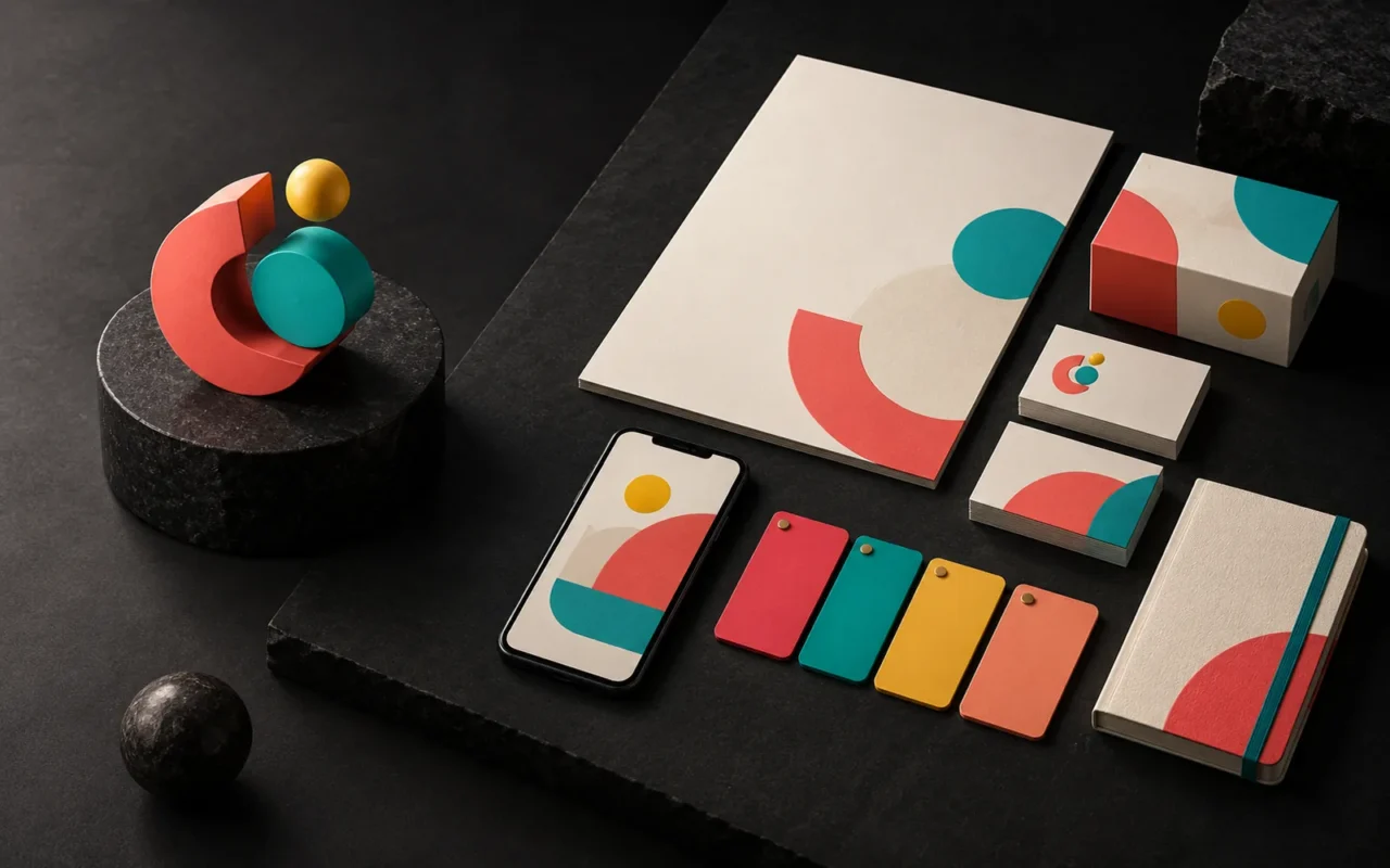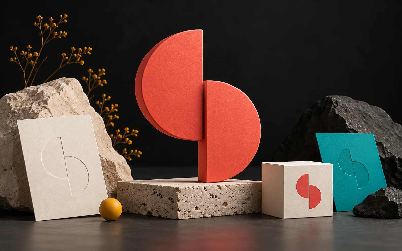
Brand identity is much more than a logo. When color, typography, visual language, tone of voice and application standards come together, a brand is perceived as more memorable, trustworthy and professional. In this article, we explain what a brand identity is made of, why it matters, and how even a small business can build one step by step.
In short
- A brand identity consists of a logo, colors, typefaces, visual language, tone of voice and the rules for using them.
- A consistent identity makes it easier for customers to recognize and remember your brand.
- Identity is how a brand wants to present itself; brand image is the picture that forms in the customer's mind.
- When your website, social media and printed materials share one identity, your brand looks more professional.
- An identity is not designed once and forgotten; a guideline protects it, and it evolves as your needs change.
What is brand identity?
Brand identity is the way a business presents itself to the outside world. Your name, logo, colors, typefaces, the style of your photos and illustrations, and even the tone of your emails are all part of it. In other words, identity is the whole that customers meet at every point where they see or hear from you.
There is an important distinction here. You build your brand identity; it describes how you want your brand to be seen. Brand image, on the other hand, is the perception that forms in the customer's mind based on their experiences. Good identity work aims to bring these two pictures closer together.
The core elements of a brand identity
A brand identity usually consists of the following parts. Each one has meaning on its own, but their real strength appears when they work together.
Logo and its variations
The logo is the most visible part of an identity. However, a single logo file is not enough. You need horizontal and vertical layouts, a one-color version, and versions for dark and light backgrounds. A simple mark that stays legible at small sizes is also often useful.
Color palette
Colors make a brand recognizable at first glance. That is why you need to define primary and secondary colors with exact codes. For example, you set HEX and RGB values for screens and CMYK or Pantone equivalents for print. As a result, the same color looks close to identical on your website, your business card and your signage.
Typography
Typefaces carry the brand's voice visually. Usually, choosing one typeface for headings and one for body text is enough. Also make sure the typefaces you choose fully support every language you work in; for a Turkish company, that means characters such as ç, ğ, ı, İ, ö, ş and ü.
Visual language
Photo style, icons, illustrations, patterns and layout make up the visual language. For example, a brand that always uses bright, simple photos evokes different feelings than one that uses dark, dramatic imagery.
Tone of voice
Tone of voice is how the brand speaks. Nielsen Norman Group describes tone along four dimensions: formal or casual, serious or funny, respectful or irreverent, matter-of-fact or enthusiastic. The brand's character should stay constant; however, the tone can flex slightly depending on the topic and the reader's situation.
Application standards
Finally, you need rules that explain how all these elements are used. How much space stays clear around the logo, its minimum size and which version goes on which background all belong here. These rules are usually collected in a brand guideline.
Why does brand identity matter?
The value of a brand identity does not come from a single benefit but from several effects that reinforce each other.
It builds recognition. Customers who see the same colors, the same typefaces and the same visual language again and again notice your brand faster. Consistency is the foundation of recognition.
It builds trust. If your business card, website and social media account look like they belong to three different companies, customers notice. In contrast, customers who see the same character at every touchpoint feel they are dealing with an organized, careful business.
It makes you look professional. A well-planned digital and visual foundation makes a brand look more professional. For example, giving users quick access to the information they need, making sure the page works smoothly on mobile and structuring content for search engines all have a direct impact on conversion rates. It is also worth remembering that Google evaluates sites primarily by their mobile version.
It makes decisions easier. A defined identity saves your team from deciding everything from scratch on each new job. When you prepare a brochure, a presentation or a social media post, the colors, typefaces and layout are already set. That saves time and reduces the risk of mistakes.
It sets you apart from competitors. Among businesses that offer similar services, customers first see the difference in appearance and tone. An original identity makes you stand out in the crowd.
How do you build a brand identity?
You don't have to be a large company to build a brand identity. The following steps apply to businesses of every size.
- Clarify your goals and audience. Write down who you are speaking to, your sector and your competitors. Looking at the colors and tone your competitors use shows where your differentiation can come from.
- Define the brand's character. If your brand were a person, how would it speak? Summarize that character in three to five adjectives.
- Design the logo and core elements. The logo, colors and typography take shape around this character. Test the logo in real use cases such as a business card, a website and social media.
- Write the rules down. Collect color codes, typefaces and logo usage rules in a guideline.
- Apply it the same way everywhere. Your website, social media templates and printed materials should all draw on the same guideline.
Don't forget accessibility
When you choose colors, look at legibility as well as aesthetics. The W3C's accessibility guidelines (WCAG) require a contrast ratio of at least 4.5:1 between text and background for normal text and at least 3:1 for large text. Text that is part of a logo is exempt; however, the menu, button and paragraph colors on your website should meet these ratios.
Our experience
At Artsution, we treat brand identity not just as a logo job but as a system that covers every touchpoint of the brand. In our projects, we follow this approach:
- We start with an analysis of your goals, sector and competitors.
- We plan page structure and content flow around user intent.
- We build the design language to strengthen brand perception.
- We set up the technical foundation with a focus on speed, security and manageability.
- We plan post-launch measurement and improvement steps from the start.
Thanks to our background in graphic design and illustration, we also produce the elements that complete an identity, such as icons, patterns and illustrations, within the same team. As a result, the identity stays consistent from the website to the packaging, as if it came from a single hand.
Frequently asked questions
Are brand identity and a logo the same thing?
No. The logo is only one part of a brand identity. In addition to the logo, identity covers colors, typefaces, visual language, tone of voice and the rules for using them.
Does a small business need a brand identity?
Yes. In fact, a consistent look is even more valuable for small businesses, because customers often see you for the first time on a business card, in a post or on your website. To start with, a logo, a color palette, two typefaces and a short usage guide can be enough.
When should a brand identity be refreshed?
If your services, target audience or positioning have changed significantly, it makes sense to review your identity. However, frequent radical changes weaken the recognition you have built. That is why small improvements are often a better choice than a completely new identity.
What should a brand guideline include?
The essentials are logo versions and usage rules, color codes, typefaces, examples of the visual language and short principles for tone of voice. Sample applications such as a business card, letterhead and social media template also make the guideline far more useful.
Conclusion
A brand identity lets your business appear with the same character at every touchpoint. As a result, customers recognize you more easily, trust you more and see you as more professional. Successful work comes from thinking about design and technology together. Artsution considers not only what a brand needs today, but also the foundation it will need as it grows.
If you'd like to build a consistent identity for your brand, take a look at our identity design service, explore our web design and social media design services to bring your identity online, or get in touch with us.
Sources5
- Wikipedia — Brand identity (brand identity vs. brand image) en.wikipedia.org
- Wikipedia — Visual brand language (consistency in visual language) en.wikipedia.org
- Nielsen Norman Group — The Four Dimensions of Tone of Voice nngroup.com
- W3C WAI — Understanding SC 1.4.3 Contrast (Minimum) w3.org
- Google Search Central — Mobile-first indexing best practices developers.google.com