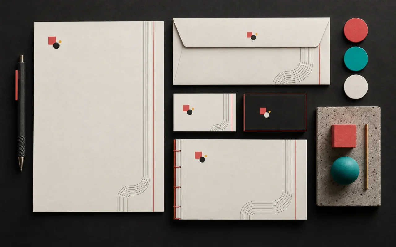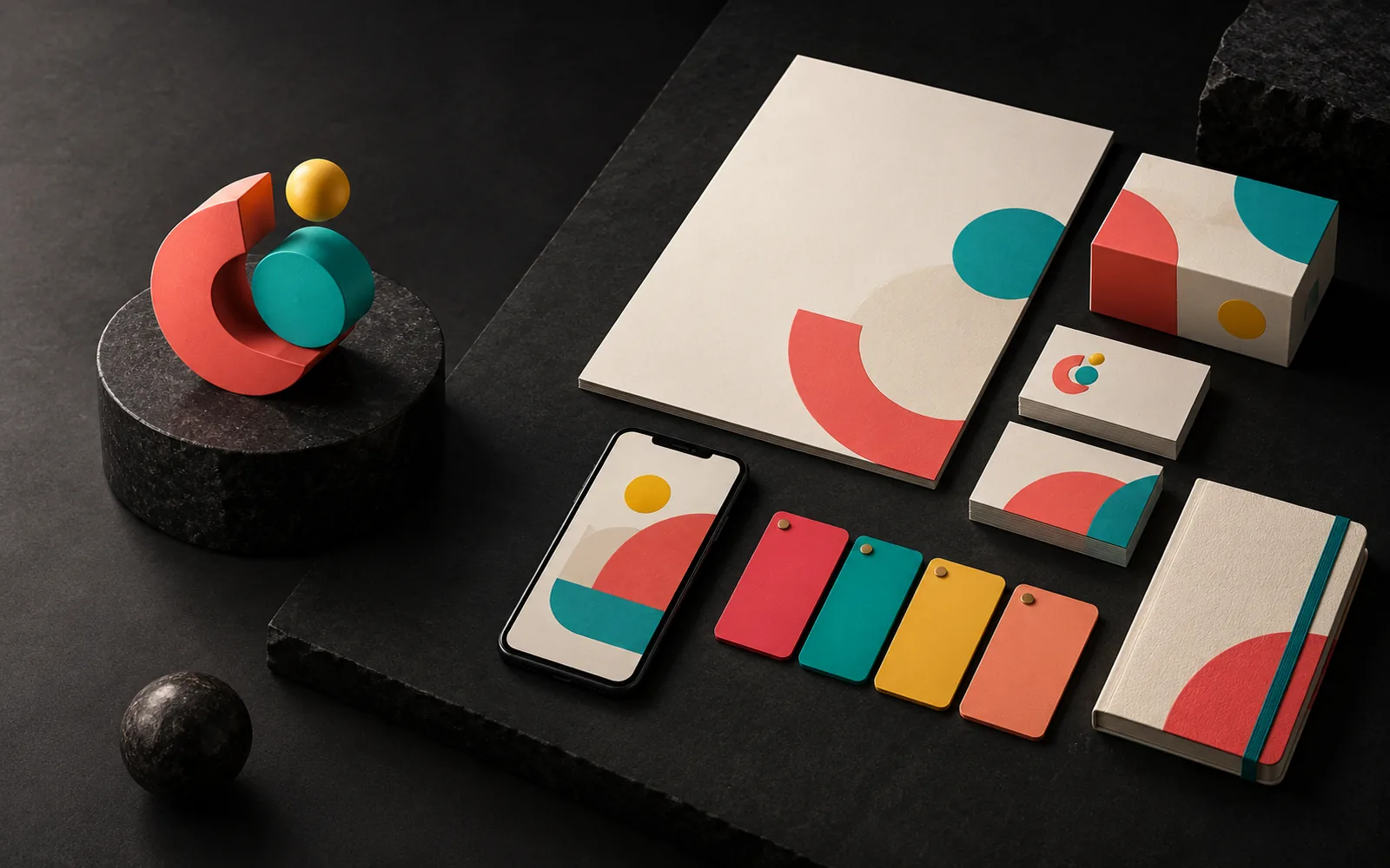
The difference between a logo and a corporate identity is like the difference between a signature and the entire correspondence system that signature appears in. A logo is a single graphic mark that identifies your brand. A corporate identity is the system made up of the logo, colors, typefaces, visual language and usage rules that makes your brand look the same everywhere, from business cards to your website, from packaging to signage. In short, the logo is part of the identity, not the identity itself.
In short
- A logo is the graphic mark that identifies a brand; a corporate identity is the visual system built around that mark.
- A corporate identity covers the color palette, typography, visual language, application examples and a usage guide.
- Businesses that start with only a logo find that every new design starts to look different.
- The right order: brand strategy first, then the logo, then the identity system.
- An identity system is the most practical way to stay consistent when you work with different suppliers.
What is a logo?
A logo is a graphic mark, emblem or symbol that helps people recognize an organization or a product. It comes in three basic forms:
- Wordmark (logotype): The brand name written in specially designed or arranged lettering.
- Symbol (emblem): An abstract mark or one that represents an object.
- Combination mark: A symbol and lettering used together in a fixed arrangement.
A good logo stays legible at small sizes, works in a single color and is recognizable on different backgrounds. Logos are resized for everything from large screens to small phone displays, so simple shapes and clean lines are preferred. We explained in a separate post why a logo should be in vector format.
What is a corporate identity?
A corporate identity is the whole that defines your brand's visual language and ensures that language is used by the same rules everywhere. A typical identity system includes:
- The logo and its versions: Full color, single color, reversed (for dark backgrounds), horizontal and vertical layouts; a minimum size and the clear space to leave around it.
- Color palette: Primary and secondary colors, with color codes defined separately for print and screen.
- Typography: Typefaces for headings and body text, and how they are ranked.
- Visual language: Photography style, illustration style, icon set, graphic elements and patterns.
- Applications: Examples such as business cards, letterhead, envelopes, email signatures, presentation templates, social media templates, signage, vehicle wraps and packaging.
- Usage guide: The document where all these rules are written down. The guide also shows the "don'ts" with examples (stretching the logo, changing its colors, adding shadows and so on).
The purpose of a corporate identity is consistency. The lasting elements of a design language keep the brand familiar even as details change over time.
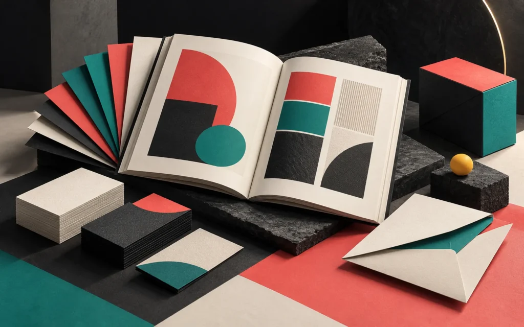
Logo vs. corporate identity: side by side
| Logo | Corporate identity | |
|---|---|---|
| What is it? | A single graphic mark | A visual system and a set of rules |
| Question | "How do people recognize us?" | "How do we look and speak everywhere?" |
| Contents | A symbol, lettering or both | Logo + color + typography + visual language + applications + guide |
| Use | On every product and channel | A reference for every design decision |
| Deliverables | Logo files | Logo files, templates and a usage guide |
| Without it | The brand isn't recognized | Every design looks different and the brand fragments |
The impact on your business: is a logo enough?
For a small business, the first need is usually a logo, and that's natural. The problem appears as the business grows. Imagine that over one year you had these jobs done by different people:
- Business cards designed by a print shop,
- The website by an agency,
- Social media visuals by a freelancer,
- Product labels by a packaging company,
- A trade show booth by an events company.
If all you have is a logo file, each of them picks the colors, typefaces and way of using the logo according to their own interpretation. The result is five different "brands." Your customers have to get to know you again at every touchpoint.
A corporate identity system solves this problem: everyone works from the same guide, the same color codes and the same templates. Design work also gets faster, because you don't have to make every decision from scratch for each new job. In our post on why brand identity matters, we also looked at how this consistency affects trust.
The right order: strategy, logo, identity
It's tempting to start an identity project by drawing a logo right away, but the sound order is:
- Brand strategy: Who are you, who are you speaking to, how are you different from competitors, and what tone do you want?
- Logo: Turning that strategy into a single mark.
- Identity system: Building color, typography and visual language around the logo.
- Applications and guide: Testing the system on real items and writing down its rules.
The logo is the second step of this process. A logo drawn without a strategy may look good but may not say what the brand stands for. A logo left without an identity system gradually falls apart under different interpretations. You can find the details of identity design in our post on corporate identity design essentials.
Common mistakes
- Mistaking the logo for the identity. The idea that "we have a logo, so our identity is done" leads to trouble with the first catalog or website project.
- Not defining color codes. "Our navy blue" looks like a different navy to everyone; codes should be set separately for print and screen.
- Commissioning a guide and not sharing it. A guide only works once it's shared with your suppliers.
- Changing the identity with every campaign. Campaign visuals can vary, but the core identity elements should stay fixed.
- Thinking only about screens. An identity also has to work on packaging, signage and print. If you're planning a website, our post on what to check before commissioning a corporate website helps you think about the identity and the site together.
Our experience
In our identity projects, we talk through the brand's target audience, competitors and tone before we start drawing the logo. We don't develop the logo in isolation; we test it on real applications such as business cards, the website, social media and, where relevant, packaging. On delivery, along with the logo files, we provide a guide that includes the color codes, typefaces and basic usage rules. Thanks to our background in graphic design and illustration, we also produce the visual elements that complete the identity, such as icons, patterns and illustrations, within the same team.
Frequently asked questions
Can I get just a logo now and complete the corporate identity later?
Yes, this is common for budget or time reasons. But if the person who designs the logo also defines at least the basic colors and typefaces, completing the identity later is much easier. It's also important to receive a complete set of logo files.
How many pages should a corporate identity guide have?
There's no standard page count. For a small business, a short guide covering the logo, colors, typography and a few application examples may be enough. Brands with many branches or products need a more comprehensive guide. What matters is that a supplier can make the right decision by looking at the guide.
Are brand identity and corporate identity the same thing?
They're often mixed up in everyday language. In general use, brand identity is a broader concept that also covers the brand's values, personality and voice, while corporate identity refers to its visual, application-focused side. In practice, the two are planned together.
If I refresh my logo, do I have to change the whole identity?
Not necessarily. A small simplification of the logo may still fit the existing colors and typography. But if the logo changes radically, you need to check whether the other identity elements fit the new direction. Planning the transition keeps the old and new looks from circulating side by side for a long time.
Conclusion
A logo is your brand's signature; a corporate identity is the system that lets you sign with the same confidence everywhere. Starting with just a logo is possible, but as your business grows, an identity system that defines colors, typefaces and usage rules is the most practical way to stay consistent.
If you want to turn your logo into an identity system or review your current identity, take a look at our brand and corporate identity service, see our catalog and brochure design page for your catalogs and printed materials, or get in touch.