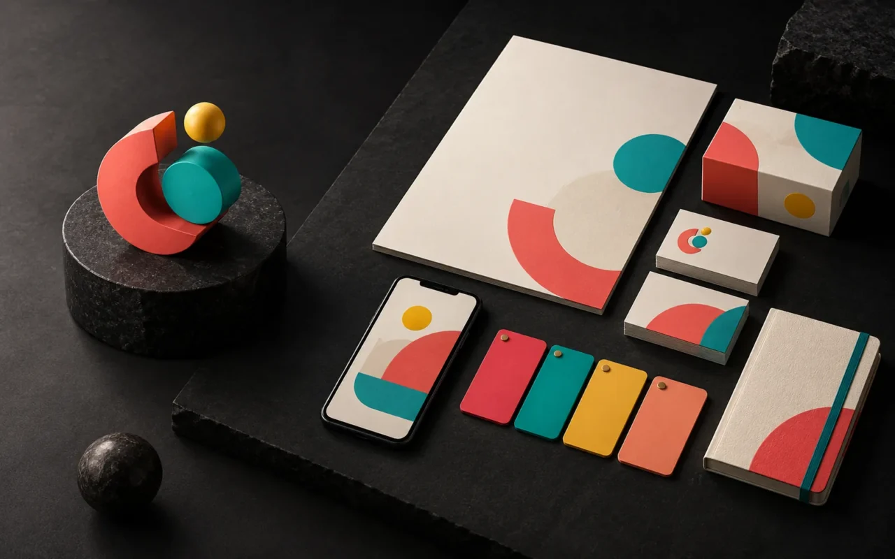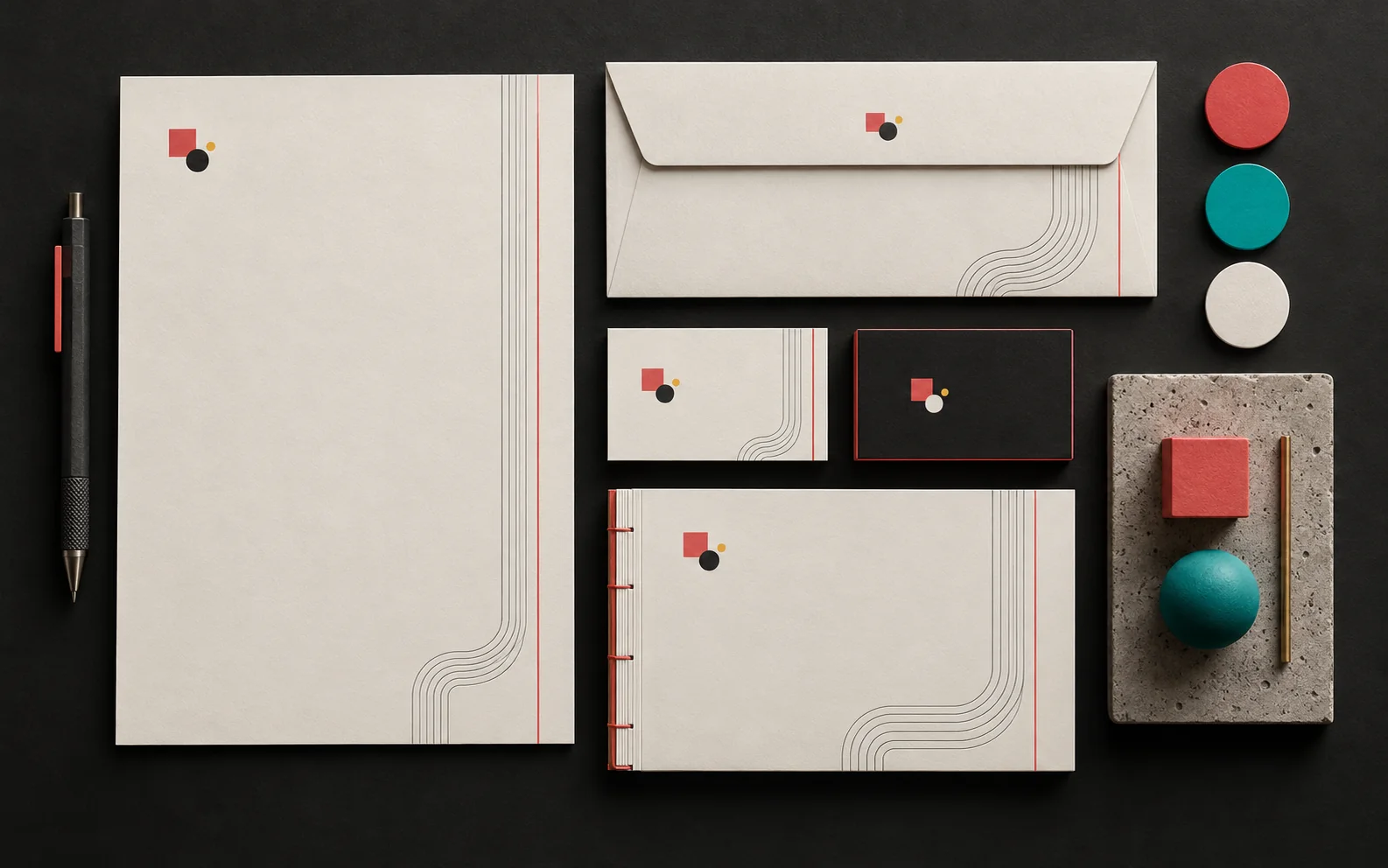
The most important thing to get right in corporate identity design is consistency. The logo, color system, stationery, social media templates and digital interfaces should all carry the same brand character. In this article, we explain which items a corporate identity project includes, what to watch for in each one, and how to protect your identity over the long term.
In short
- A corporate identity consists of the logo, colors, typefaces, stationery, digital applications and the guideline that governs them.
- Define logo versions for different backgrounds and sizes, a clear space and a minimum size from the start.
- Define colors separately for screen (RGB/HEX) and print (CMYK, and Pantone where needed).
- Prepare every item, from business cards to email signatures, on the same grid and typography.
- An identity guideline is the most practical way to keep things consistent, even when your team changes.
What is corporate identity?
Corporate identity is the full picture of how a company presents itself to the public. On the visual side, it includes the logo, colors and typefaces. In addition, signage, vehicle graphics, uniforms, office design and the appearance of customer-facing staff are also part of the identity. In other words, corporate identity covers every surface the logo is applied to.
Our article why brand identity matters explained the effect of identity on recognition and trust. This article, however, focuses on the practical side of applying it.
Why is consistency the key issue in corporate identity design?
Consistency lets customers recognize you as the same company at every touchpoint. For example, if your website has a modern navy look but your business card uses another color and an old logo, customers may think they are dealing with two different firms.
That is why you should design the whole system, not just individual pieces. Corporate identity guidelines typically define approved color palettes, typefaces and page layouts together. As a result, even when different people prepare different materials, the outcome looks like one family.
A well-planned digital and visual foundation makes a brand look more professional. Giving users quick access to the information they need, making sure the page experience works smoothly on mobile and structuring content for search engines also have a direct impact on conversion rates. Corporate identity is the visual basis of that foundation.
Logo usage: versions, clear space and minimum size
The logo is the center of the identity, but a single file does not work everywhere. For this reason, we recommend preparing the following versions in an identity project:
- Primary logo: The full-color version you will use most often.
- Horizontal and vertical layouts: For wide areas (the website header) and narrow ones (a social media profile picture).
- One-color and reversed (negative) versions: For dark backgrounds, single-color printing and applications such as embossing.
- Symbol (mark): For app icons, the favicon and very small uses.
Clear space and minimum size
Clear space is the empty area around the logo that no other element may enter. It is usually defined by a measure such as the height of one part of the logo. As a result, this space lets the logo breathe and keeps it legible.
The minimum size is the limit below which the logo should not go, in millimeters for print and in pixels on screen. To set this limit, actually shrink the logo and test it, because thin lines and small lettering disappear below a certain size.
Keep the logo's source files in vector formats (AI, EPS, SVG or vector PDF). This matters because vector files stay sharp at any size. Pixel-based files such as PNG, by contrast, are only for use at specific sizes.
Color system: separate definitions for screen and print
In practice, corporate colors are the fastest-recognized part of an identity. However, the same color is produced in different ways on screen and on paper. That is why you need to define several equivalents for each color:
| Use | Color definition | Where? |
|---|---|---|
| Screen | HEX and RGB | Website, social media, presentations |
| Four-color print | CMYK | Brochures, catalogs, business cards |
| Spot-color print | Pantone (spot color) | Packaging, stationery, signage |
Spot color systems such as Pantone help different printers hit the same color. That said, not every Pantone color can be reproduced exactly in CMYK. So when you choose a color, check its print equivalent too.
Also define secondary colors and neutral tones alongside the primary colors. For example, one primary color, one accent color and two or three grays are enough for most identities. On the website, make sure there is enough contrast between text and background colors; the W3C accessibility guidelines recommend a ratio of at least 4.5:1 for normal text.
Typography and font licenses
As a rule, one typeface for headings and one for body text is enough. Make sure the typefaces you choose fully support the languages you work in; for a Turkish company, that includes Turkish characters. Also check the font license. Some typefaces license desktop (print) and web use separately.
Corporate stationery
In addition, stationery is the part of the identity that changes hands most often. A typical set includes:
- Business cards
- Letterhead (the standard size in Turkey and Europe is A4, 210 × 297 mm)
- Envelopes and folders
- Invoice, quotation and order form templates
- Email signature and presentation template
Prepare all of these items on the same grid, with the same typefaces and the same color rules. For example, having the logo at the top left on the letterhead but at the top right on the invoice is a small but noticeable inconsistency.
Social media templates and digital interfaces
Today, customers often meet your brand on a screen first. That is why a corporate identity should cover digital applications too:
- Social media templates: Fixed layouts for posts, stories and cover images, so you don't have to design every post from scratch.
- Website: Colors, typefaces, buttons and icons should match the identity guideline.
- Other interfaces: A customer portal, mobile app or email newsletter, if you have one, should speak the same language.
The identity guideline: how to keep things consistent
An identity guideline (brand guideline) is the document that collects all the rules. Without one, an identity erodes over time, because every new designer, printer or employee adds their own interpretation.
For example, a good guideline includes logo versions and forbidden uses, clear space and minimum size, color codes, typefaces and hierarchy, photo and icon style, and examples of stationery and digital templates. Keep the guideline short and visual; in the end, the guideline that gets used most is the one that is easiest to read.
Our experience
In corporate identity projects, we follow this approach:
- We start with an analysis of your goals, sector and competitors.
- We plan page structure and content flow around user intent.
- We build the design language to strengthen brand perception.
- We set up the technical foundation with a focus on speed, security and manageability.
- We plan post-launch measurement and improvement steps from the start.
We don't develop the logo in isolation; we test it on real applications such as business cards, the website, social media and, where relevant, packaging. At handover, along with the logo files, we provide a guideline with the color codes, typefaces and basic usage rules.
Frequently asked questions
Is there a difference between corporate identity and brand identity?
In practice, the two terms are often used interchangeably. In general, brand identity describes the brand's character and perception, while corporate identity describes how that character is reflected across all of the company's applications.
Which files should I receive from a corporate identity project?
We recommend receiving the logo's vector source files, PNG and SVG versions for screen, color codes, typeface details, editable files of the stationery templates and the identity guideline.
Do I need to change my current identity completely?
Not always. In many cases, it is enough to simplify the logo, clarify the color system and complete the missing applications. That way, you move to a more consistent look without losing the recognition you have built.
Conclusion
The essence of corporate identity design is consistency. When logo versions, the color system, typography, stationery and digital applications all draw on the same rules, your brand appears with the same character everywhere. Successful work comes from thinking about design and technology together. Artsution considers not only what a brand needs today, but also the foundation it will need as it grows.
If you'd like to build or tidy up your corporate identity together, take a look at our identity design service, see our social media design and web design pages for digital applications, or get in touch with us.
Sources4
- Wikipedia — Corporate identity (elements of corporate identity and corporate guidelines) en.wikipedia.org
- Wikipedia — Pantone (Pantone Matching System, spot colors that CMYK cannot reproduce) en.wikipedia.org
- Wikipedia — ISO 216 (A4 size and its use in Turkey) en.wikipedia.org
- W3C WAI — Understanding SC 1.4.3 Contrast (Minimum) w3.org